Mining Projects Are Trending - and It's Not on TikTok: The Data Behind ASX Exploration Momentum
Explore how AI and text analytics are uncovering which ASX mining projects are gaining momentum. A data-driven look at "Rising Stars" and "Emerging Opportunities" in Australia's exploration market.

The Challenge: A Mountain of Data, A Shortage of Insight
Our journey began with a powerful but fundamentally static asset: a comprehensive database of over 5,000 mining projects owned by publicly listed companies. This dataset is a rich tapestry of information, detailing everything from project names and locations to commodities, development status, and geological data.
While invaluable, this data represents a single snapshot in time. It tells us what a project is, but it cannot tell us its story. Is it a forgotten asset on the back burner? Is it a company's core focus? Or is it a brand-new acquisition about to become the market's next obsession?
To answer these questions, we knew we had to look beyond the database and into the dynamic, chaotic world of market communications. We turned our attention to the daily deluge of ASX announcements-the primary channel through which companies tell their story to the world. The challenge was clear: could we systematically bridge the gap between our structured project database and this vast ocean of unstructured text to measure what truly matters: momentum?
From Raw Counts to "Share of Voice": A New Metric for Project Importance
Our first step was to quantify how often each project was being discussed. We developed a system to perform a sophisticated frequency analysis, searching through millions of pages of ASX announcements for mentions of each specific project name.
However, a simple frequency count isn't enough. A major producer like BHP might mention a project 50 times in a year as part of routine operations, while for a junior explorer, 50 mentions could signal a company-making discovery.
To create a fair comparison, we developed a more powerful metric: Share of Voice (SOV).
- What is Share of Voice? For any given period (a month or a year), a project's Share of Voice is the percentage of a company's total announcements that mention that specific project.
This metric normalizes the data, revealing not just how often a project is mentioned, but how important it is relative to everything else the company is doing. A project with a 20% SOV means that one in every five announcements from that company is related to it-a clear signal of strategic focus.
Glimmers of Insight: The Four Archetypes of Mining Projects
As we began analyzing the Share of Voice data over time, fascinating and distinct patterns emerged. Even with a small, random sample, we could immediately classify projects into clear strategic archetypes:
The Flagship Asset (Sustained High Focus)
- Example: A project like the Mackay Potash Project (AMN).
- The Data Signature: A consistently high Share of Voice year after year (e.g., 16.5% in both 2024 and 2025).
- Interpretation: This is unambiguously a core, defining asset. It is central to the company's story and strategy, commanding a significant and stable portion of their public communications.
The Fading Star (De-prioritized Asset)
- Example: A project like the Erongo Project (GIB).
- The Data Signature: A dramatic drop in SOV, for example, from a high of 10% in 2024 down to just 2% in 2025.
- Interpretation: The data signals a significant strategic shift. A project that was once a key focus has been moved down the priority list. This prompts critical questions: Was it due to poor results? A pivot to a new asset? Or is it being prepared for divestment?
The "Simmering" Asset (Consistent Low Focus)
- Example: A project like the Eastern Group Tenements (HLX).
- The Data Signature: A stable but low Share of Voice, consistently in the 3-8% range over time.
- Interpretation: These are the "bread and butter" projects. They are an active and important part of a company's portfolio, receiving regular updates, but are not the sole flagship.
The Dormant or Non-Core Asset
- Example: Projects like the Raggard Hills Manganese Project (FRB).
- The Data Signature: Zeros across the board. No mentions, no Share of Voice.
- Interpretation: Our data perfectly validated the status of these assets. They are not part of the current public conversation, confirming they are on care and maintenance, held for strategic purposes, or simply inactive.
From Manual Patterns to Automated Screens
Identifying these archetypes manually was insightful, but the real power lay in automation. We used these data signatures to build systematic "screens"-algorithms that could scan our entire dataset and automatically categorize projects into strategic groups like "Momentum Leaders," "Waking Giants," and "Fading Stars."
This transformed our analysis from a spot-check into a dynamic monitoring system. But it also led us to a deeper, more important question. We could now see who was getting attention, but we couldn't automatically tell why.
Decoding the "Why": Using AI Topic Modeling to Find the Signal in the Noise
A project's Share of Voice can be high for many reasons. Is it because of a game-changing drill intercept, or is it just because the project was mentioned in every quarterly report and AGM presentation? To differentiate hype from substance, we needed to understand the nature of the announcements driving the buzz.
This is where we deployed Natural Language Processing, specifically topic modeling. For each strategic group, we extracted the titles of every announcement that mentioned a project and fed them into a BERTopic model. The goal was to let the AI discover the hidden thematic clusters within the news flow.
The results were striking. The model clearly separated the "noise" from the "signal":
- The "Noise" (Routine Reporting): A huge number of announcement titles fell into predictable topics like "Quarterly Activities Report," "Annual Report to Shareholders," and "Investor Presentation." This is the baseline buzz required of any listed company.
- The "Signal" (Geology-Driven Catalysts): Buried within the noise were the golden nuggets. The model identified distinct topics with keywords like drilling_commences_project, antimony_high_grade_silver, and lithium_seymour_identified.
This was the breakthrough. We could now programmatically identify which announcements were about genuine, value-creating geological events. By defining these "Geology Topics," we could calculate a "Geology Buzz Score" for every project-the percentage of its recent news flow driven by actual exploration and discovery.
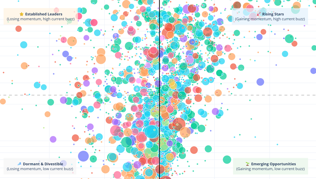
The Grand Synthesis: The Project Momentum Matrix Chart
We now had all the components to build our ultimate visualization: a strategic map of the entire ASX resource sector.
📊 Interactive Chart Available
This visualization is best viewed on a larger screen. Click below to open the full interactive chart in a new tab.
Open Interactive Chart →💡 Tip: Double-click legend items to isolate commodities, single-click to toggle visibility.
This 4-quadrant bubble chart combines all our analytical layers:
- The X-Axis (Momentum): The change in Share of Voice from last year to this year.
- The Y-Axis (Current Buzz): The average Share of Voice over the last three months.
- The Bubble Size (Geology Buzz Score): A larger bubble means a higher percentage of the buzz is driven by real geological news.
- The Bubble Color (Commodity): Reveals market-wide thematic trends.
This matrix is a command center, offering a unique narrative for every player in the mining ecosystem. For investors, it separates high-potential "Rising Stars" from hype-driven assets. For geologists and executives, it's a powerful tool for competitive benchmarking and identifying emerging regional plays. For M&A teams, the "Dormant & Divestible" quadrant is a curated list of acquisition targets. And for service providers, the "Emerging Opportunities" are a pipeline of future clients.
What the Map Tells Us Today: A Market in Motion
Our final visualization tells a powerful story. We see a hive of activity, with intense competition for attention among projects in the "Rising Stars" quadrant. Thematic momentum is undeniable, with the colors for Precious Metals, Lithium, Base Metals, and Rare Earths dominating the high-growth areas, confirming where capital and news flow are concentrated.
Most importantly, the "Hype vs. Substance" spectrum is now visible. In every quadrant, you can see large bubbles (momentum backed by geology) next to small ones (momentum driven by corporate chatter). This allows for an immediate, nuanced understanding of the market that was previously impossible to achieve at scale. This journey, from a static list of projects to a dynamic, intelligent map, demonstrates the transformative power of applying AI to the rich, unstructured data that surrounds us.
Put Your Projects on the Map
The Project Momentum Matrix provides a market-wide view, but its real power is in bespoke analysis. How does your project benchmark against its true peers? What is the narrative driving your competitors' momentum?
At RadiXplore, we help you answer these critical questions.
- For Executives & Exploraton Managers: We provide confidential benchmarking reports, mapping your entire portfolio against your competitors to identify strategic strengths, weaknesses, and communication gaps.
- For Investors & Funds: We build custom screens to identify opportunities that match your specific investment thesis, filtering by commodity, catalyst type, and momentum profile.
- For Corporate Advisory & Service Providers: We help you build targeted, data-driven pipelines, identifying M&A targets or new clients based on their position and trajectory on the Momentum Matrix.
Contact us today for a private demonstration and discover the story the data is telling about your place in the market. Let RadiXplore AI help you navigate the noise and find your signal.
Let RadiXplore help you navigate the noise and find your signal.
Contact us today for a private demonstration and discover the story the data is telling about your place in the market.
Contact Us