The Booms and Busts of Western Australian Mining: A Century of Data Analysis
Explore the highs and lows of Western Australian mining through data analysis, revealing trends and insights visualized through engaging charts

Western Australia’s mining industry has long been a cornerstone of the region’s economy, driving growth and development through its rich deposits of minerals and resources. Over the past century, the landscape of mining tenements has experienced significant fluctuations, reflecting the booms and busts that characterize this dynamic sector.
In this blog post, we delve into the Historic Tenements dataset of Western Australia, spanning over 100 years of data. By analyzing this extensive dataset, we aim to uncover intriguing trends and patterns that have shaped the mining industry. From the peak periods of activity to the quieter phases, this exploration offers a unique perspective on how the industry has evolved and adapted over time.
Join us as we journey through the highs and lows of Western Australian mining, revealing the stories behind the numbers and analyzing the data to uncover the factors that have influenced these trends. While our analysis provides valuable insights, it would be even more enriching to hear from industry veterans and experts who can correlate these trends with significant mining events and policies. Whether you’re a mining enthusiast, a data analyst, or simply curious about the history of this vital industry, there’s something here for everyone.
The earliest valid date recorded within this dataset is from a "Gold Mining Lease" from July 1897. They don't seem to have a record of the holder name. So for this analysis we filtered our data to analyze 1897 onwards.
Analyzing the number of tenements created and relinquished over the years can provide valuable insights into mining activity trends over time.
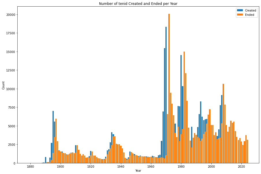
The chart highlights the cyclical nature of the mining industry, with periods of intense activity followed by downturns.
By adding another dimension to this chart—Tenement Types—we can uncover even more detailed insights.
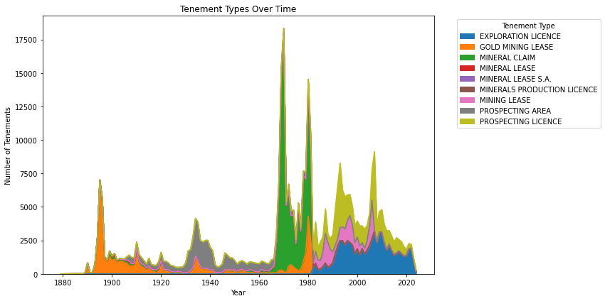
The 1972 peak primarily consisted of “Mineral Claims,” which originated from the Mining Act of 1904 and are no longer in use. On June 28, 1991, a graticular boundary (or block) system was introduced for Exploration Licences, represented by the blue area in the chart.
The Heatmap of Tenement Duration is a visualization that displays the average duration of tenements based on two variables: the type of tenement and the year it started. Lets break down what this heatmap is showing
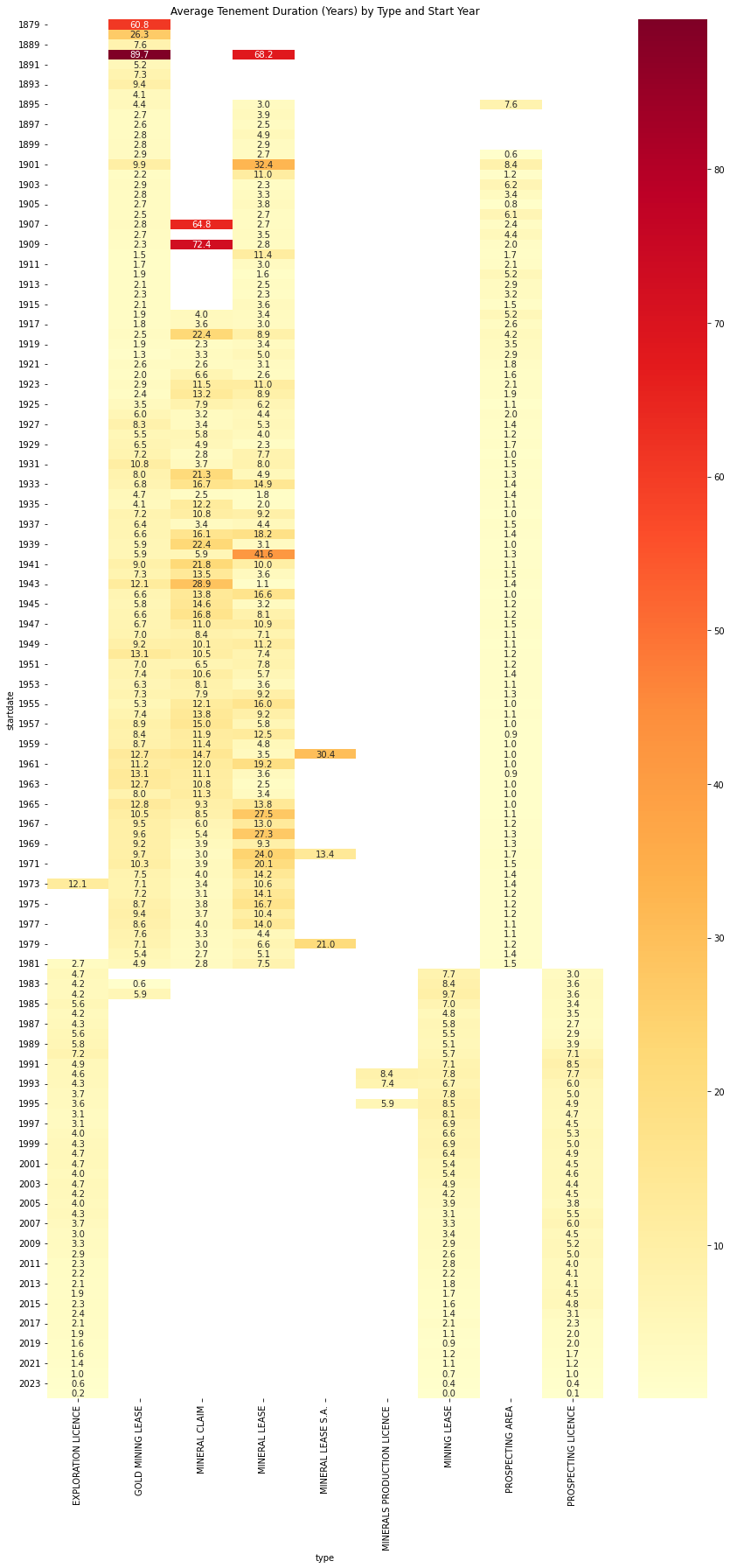
- X-axis (Columns): This represents the different types of tenements. like "GOLD MINING LEASE", "EXPLORATION LICENSE", etc.
- Y-axis (Rows): This shows the years, specifically the start years of the tenements.
- Color Scale: The colors in the cells represent the average duration of tenements. Typically, darker or more intense colors indicate longer durations, while lighter colors represent shorter durations.
- Each Cell: A single cell in the heatmap represents the average duration of all tenements of a specific tenement type that started in a specific year.
- Pattern Recognition:
- Vertical patterns show how the duration of a particular tenement type has changed over the years.
- Horizontal patterns reveal differences in duration across tenement types for a given year.
- Overall color distribution gives an idea of general trends in tenement duration.
- Numerical Values: These represent the actual average duration values, typically in years.
What insights can we gain from this visualization?
- Tenement Type Comparison: We can quickly see which types of tenements tend to have longer or shorter durations.
- Historical Trends: The heatmap reveals how tenement durations have changed over time. For example, the mining tenements based on the 1904 Mining Act allowed entities to hold on the tenements for decades. In comparison, the recent ones are all under 10 years.
- Economic Indicators: Patterns in the heatmap could correlate with economic conditions. For instance, longer durations might indicate periods of economic prosperity in the mining sector.
- Anomalies: Any cells with significantly different colors from their surroundings could represent unusual events or special cases which are worth investigating.
This heatmap is particularly useful for identifying long-term trends and patterns in tenement durations that might not be immediately apparent from raw data or other types of charts. It allows us to simultaneously compare across tenement types and over time, providing a comprehensive view of how tenement durations have evolved in Western Australia's mining industry.
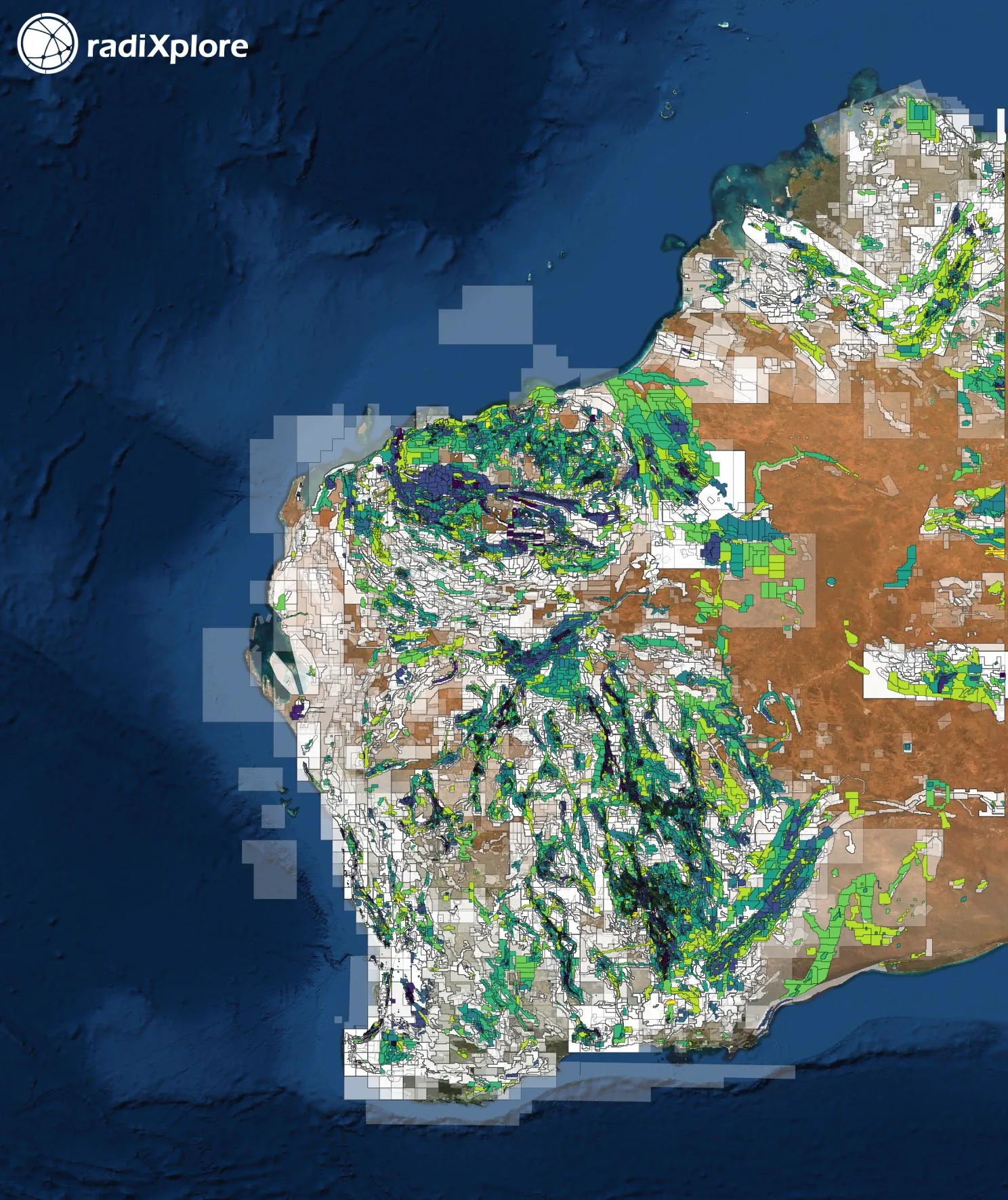
When it comes to visualizing the number of tenements created and relinquished over time, a heatmap is an ideal tool. Given the vast number of tenements in our dataset, plotting their actual outlines would result in a very cluttered and unreadable plot. A heatmap, however, provides a clear understanding of the density of tenements across different areas.
By looking at the color bar, you can see that the red areas correspond to tenements nearing the 50,000 mark. The predominance of red in the visualization highlights just how densely packed Western Australia’s tenements are.
The tenement data reveals that nearly all of Western Australia was covered by tenements around 2010-2012, indicating a significant exploration boom.
The extensive mining activity, coupled with Australia’s policy of making mining data publicly accessible, has resulted in a vast and rich repository of open file data. For Western Australia, this data is hosted in the WAMEX repository. While some information, such as drill hole, geochemistry, and geophysics data, has been structured into databases, the bulk of knowledge remains within handwritten and scanned copies of unstructured mining relinquishment reports.
In Western Australia alone, there are over 6 million pages of reports within more than 140,000 documents. This dataset is crucial for the mining industry to discover new exploration projects based on existing information. However, analyzing this data using conventional methods is nearly impossible, leading most companies to access only a fraction of the available information.
RadiXplore has developed an innovative AI platform designed to tackle unstructured mining datasets. Our platform emulates the work of a geologist analyzing mining data, streamlining the entire process. Instead of companies spending months searching for, downloading, cleaning, and processing data before they can even begin analysis, RadiXplore offers a seamless alternative. Companies can simply sign up on our website, select their area of interest, and describe the mineral deposit they are seeking.
RadiXplore leverages deep learning to interpret images from historical reports, natural language processing to understand text, and sophisticated language models to replicate a geologist’s analytical approach. Additionally, our platform interprets GIS data to plot the deposit’s location on a map, all within just a few hours.
Companies can choose between our Info-aaS service, which provides access to our curated database of mining data, or our SaaS offering, which allows them to use their own data with our platform.
Interested in learning more about how RadiXplore can transform your mining data analysis? Visit our website for more information and to get started.